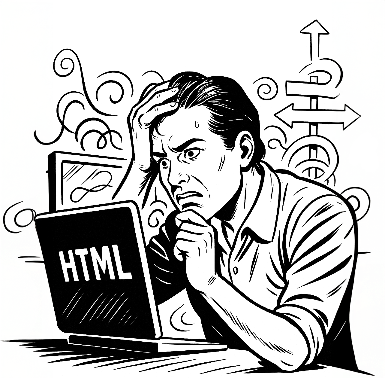
At first glance, building an HTML email might seem similar to developing a web page. After all, both use HTML and CSS, right? But any experienced frontend developer who’s attempted to create a responsive, cross-client HTML email knows the truth: email development is an entirely different beast.
This article explains why HTML email development is so different from traditional web development, what challenges you need to overcome, and how understanding these differences can save you time, frustration, and failed campaigns.
1. HTML Email Uses Tables, Not Divs
Keyword focus: table-based layout in HTML emails
Modern web development has long moved past <table>-based layouts in favor of semantic HTML and CSS grid/flexbox. But in email development, tables are still the gold standard.
Why?
Because many email clients (especially Outlook) don’t fully support modern CSS positioning techniques. Tables ensure predictable structure and alignment across the most inconsistent rendering engines.
Practical Takeaway
- Use nested <table> elements for layout, not <div>.
- Set widths and paddings using cellpadding and cellspacing.
<table role="presentation" width="100%">
  <tr>
    <td style="padding: 20px;">This is reliable across most email clients.</td>
  </tr>
</table>
2. Email Clients Are Not Web Browsers
Keyword focus: email client rendering vs browser rendering
Web developers typically build for a handful of modern browsers (Chrome, Safari, Firefox, Edge), each with robust CSS support. Email developers, on the other hand, must deal with:
- Outlook (rendered by Microsoft Word)
- Gmail (strips certain CSS styles)
- Apple Mail (generally reliable, but with quirks in dark mode)
- Yahoo, AOL, Samsung Mail, and dozens more…
Each email client interprets HTML and CSS differently. Many even strip or block embedded styles, require inline CSS, or fail to support basic rules like float or margin.
3. CSS Support Is Severely Limited
Keyword focus: limited CSS in emails, CSS best practices for emails
Many modern CSS features—like flexbox, grid, media queries, custom fonts, and pseudo-classes—don’t work reliably in email. This means:
- You can’t count on :hover or :nth-child effects.
- You must avoid position: absolute or z-index.
- CSS resets? Not a thing. You need to manually normalize styles per element.
What Works Best
- Inline styles on every element
- Basic CSS properties like font-family, color, padding, border
- Avoid shorthand where possible (margin: 0 auto → write full values)
4. You’re Designing for a Restricted, Controlled Environment
Keyword focus: responsive email design, mobile-first email, email UX
While web developers have control over CSS files, JavaScript, media queries, and responsive breakpoints, email developers operate inside a tight sandbox:
- No JavaScript
- Limited fonts
- Minimal interactivity (unless using AMP or hacks)
- Strict file size limits (typically under 100 KB)
Mobile Responsiveness?
Only possible with carefully tested media queries—and even then, Gmail on Android might ignore them unless the <style> block is inlined in the <body>.
5. Email Development Requires Heavy Testing
Keyword focus: testing HTML emails, email QA tools
Unlike websites where developers can test in a browser and expect predictable results, every HTML email must be tested across multiple clients and devices. It’s not optional.
Recommended Tools
- Litmus
- Email on Acid
- Mailtrap
- BrowserStack Email (for previewing mobile views)
These platforms let you preview how your email will look in Outlook, Gmail, iOS Mail, Yahoo, and more—before sending it to thousands of users.
Time-Saving Tip
Build a personal email QA checklist that includes:
- Mobile + desktop rendering
- Link tracking
- Alt text visibility
- Fallbacks for dark mode
6. Dark Mode Adds a New Layer of Complexity
Keyword focus: dark mode emails, dark mode compatibility
Unlike websites, emails can’t reliably detect or control dark mode rendering. Each client implements dark mode differently—some invert backgrounds, others apply partial overrides, and a few ignore your styles completely.
Your Options
- Use transparent PNGs with white logos? Risky.
- Build light and dark mode versions with conditional CSS? Often unsupported.
- Use neutral colors + strong contrast to ensure readability in both modes.
Pro Tip
Use media queries (prefers-color-scheme) only where supported, and provide high-contrast static fallbacks everywhere else.
Conclusion: HTML Email Is Its Own Discipline
While web development and email development share a foundation, the rules, limitations, and execution couldn’t be more different. Building high-quality, responsive, and compatible HTML emails is not about cutting-edge code—it’s about mastering the nuances of outdated engines, broken standards, and uncooperative platforms.
But here’s the silver lining: once you understand the rules of the game, you can dominate it. And that’s exactly what we help you do.
Want to Save Time and Avoid Costly Mistakes?
📘 Download our free guide:
“5 Essential Hacks to Save Hours in HTML Email Development”
It’s packed with actionable tips to speed up your workflow and improve compatibility.
